PhonePe · P2P Payments · 2024 – 2025
NearMe Payments
Eliminating the “last‑metre” problem in everyday P2P payments — no phone numbers, no QR codes, just pay the person next to you via Bluetooth.
Role
Senior Product Designer
Scope
End-to-end redesign
TEam
Vishwajeet Patil, Sarbani Mookherji
Platform
Android & iOS
01 - Overview
Context behind the build
Background
PhonePe processes hundreds of millions of P2P transactions. Yet everyday payments - tipping waitstaff, splitting bills with colleagues, paying auto drivers - still hit a wall: neither party has the other's number saved, and asking for a phone number or QR code mid-interaction is awkward, slow, and often impossible.
NearMe uses Bluetooth Low Energy (BLE) to surface nearby PhonePe users, making proximity the payment address. This was a 3-week engineering-led sprint with design embedded throughout - shipping to an internal CUG before broader evaluation.
Why this sprint mattered
No major UPI app had shipped proximity-based P2P. This was a first-to-market opportunity - and a genuine user pain point. The sprint format forced constraint-led design: every decision had to ship in three weeks, so speed and clarity were the design brief.
First
in UPI ecosystem
~30s
saved per transaction
Zero
contact info needed
Entry points considered
Two entry paths were evaluated for the internal launch: a new icon in the payment initiation bar, and a "Near Me" option within the existing P2P contact selection flow.
Payment initiation bar
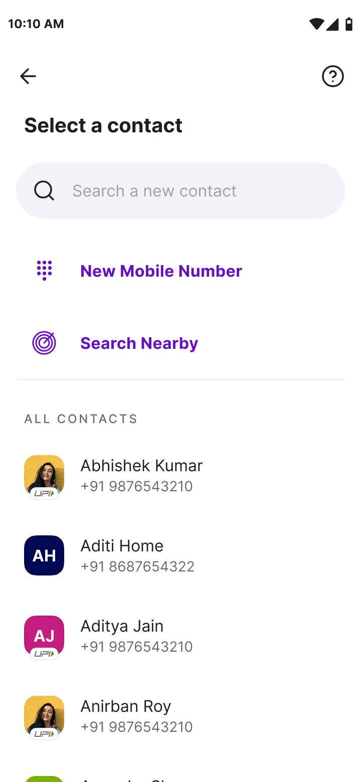
P2P → New Payment flow
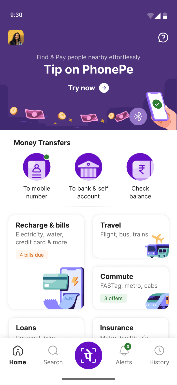
PhonePe Home (context)
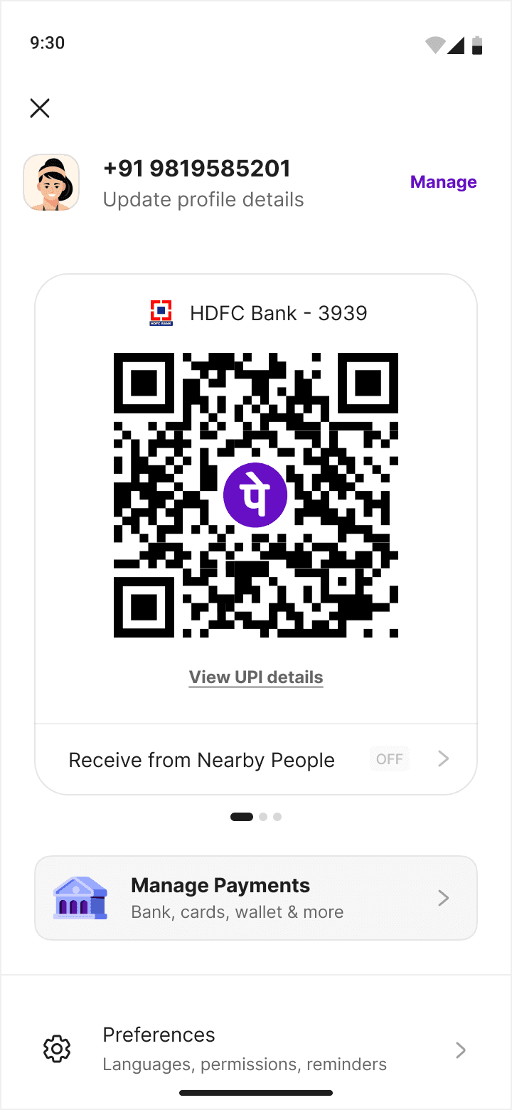
Profile page receiver toggle
02 - My Role
Design ownership in a sprint
What I owned
I was the sole designer embedded with the engineering team. With 3 weeks to ship, my focus was on high-impact decisions: the sender discovery UX, receiver settings IA, identity display logic, and the onboarding flow. I de-scoped heavy research in favour of rapid synthesis from existing user data and close PM collaboration.
UX Strategy
Interaction Design
Information Architecture
Rapid Prototyping
Dev Handoff
Stakeholder Alignment
Collaboration model
Daily standups with Android and iOS engineers. Weekly reviews with the PM and product leadership. Design and engineering worked in parallel — I was reviewing builds within days of shipping screens. This meant tight feedback loops, quick iteration, and accepting some design debt for CUG speed.
03 - Challenge
The actual problems we were solving
UX
Users needed to identify the correct person from a list of real-time strangers — without seeing profile photos or user-defined names that could be spoofed or misused.
Tech
BLE signal strength fluctuates constantly. People pop in and out of range every few seconds. The UI needed to handle a dynamically reordering list without disorienting users mid-selection.
Business
The 3-week sprint timeline meant designing in parallel with build — no room for heavy iteration cycles. Every pattern had to be right enough to ship the first time.
Security
BLE is susceptible to signal spoofing. Receiver identity had to be anchored to verified banking names — not editable aliases. This was a hard technical and design constraint.
UX
Same user = sender and receiver simultaneously. The experience needed clean mode switching without cognitive overhead or extra taps.
Success metrics for the CUG
BLE Reliability
Stable detection in real office environments across Android + iOS devices.
Task Completion
User can find, identify, and pay the correct person without assistance.
Zero Incidents
No wrong payments or identity confusion in the CUG population.
04 - Research & Insights
What shaped the design decisions
Source of truth
Given the sprint timeline, we leaned on existing PhonePe user research, funnel analytics showing drop-offs at the contact selection step, and the PM's deep knowledge of recurring user complaints. We supplemented this with a quick internal survey across CUG participants post-launch.
Key data signal
Analytics showed 12–18% of P2P attempts resulted in users exiting at contact selection — a strong signal that "finding the right person" was a genuine blocker. NearMe's hypothesis: make "who" self-evident through physical proximity instead of memory.
Friction Point
"Asking a waiter for their phone number feels transactional and weird. I just want to leave a tip quickly."
— User research synthesis
Behaviour
QR codes were frequently inaccessible — in moving vehicles, at outdoor stalls, or when the merchant was occupied.
— Observed in field sessions
Trust Signal
— Consistent across segments
Dual Role
Most users naturally shift between sender and receiver roles throughout a day — settings needed to reflect this fluidity.
— P2P usage analysis
Control
Privacy was a top concern. Users wanted a clear, prominent way to see they're discoverable — and turn it off easily.
— CUG feedback survey
Real-world
In crowded environments, the proximity list fills with strangers. Noise filtering and stable display time were critical to avoid confusion.
— Office CUG observations
05 - Defining the Problem
What we were actually building
When you're physically next to someone, you shouldn't need to know their contact details. Proximity should be enough.
HMW
How might we let users discover and pay nearby PhonePe users without any prior contact exchange?
HMW
How might we help users confidently identify the right recipient among multiple nearby strangers?
HMW
How might we give receivers meaningful control over their discoverability without adding complexity?
HMW
How might we handle BLE instability — where people pop in and out — without confusing users mid-payment?
HMW
How might we fit this into PhonePe's existing IA without cluttering the home page or confusing existing flows?
06 - Design Process
3 weeks, compressed carefully
The sprint compressed the typical design cycle. Some phases ran simultaneously — wireframes were being reviewed while research synthesis was still happening in the background.
07 - Exploration
What we tried and why we chose
The 3-week timeline pushed us toward making faster, higher-conviction calls on direction. Below are the key decision points where multiple approaches were considered.
The core layout question: how do you display people?
The most consequential UX decision in the entire product was how to display a real-time, dynamically shifting list of nearby strangers — in a way that's scannable, identity-safe, and stable enough to trust mid-payment. We explored three distinct approaches before converging.
Radar View
People plotted spatially on a BLE scan circle with a sweeping animation. Closest receivers appear nearest the centre.

Pros
Spatially intuitive — mirrors the real-world mental model of "who's closest"
Radar sweep elegantly communicates active scanning state
Visually distinct; strong product identity moment for small groups (2–5 people)
No truncation issues — names sit below each avatar with room to breathe
Cons
BLE RSSI ≠ real distance — spatial placement is misleading and can erode trust
Crowded rooms (8+ people) cause severe avatar overlap and unreadable names
RSSI fluctuation means avatars drift continuously — disorienting when trying to tap
Needs a list fallback for 7+ people anyway — can't scale alone
Deferred — Revisit post-V1 for a close-range, small-group scenario (e.g. one-on-one tip)
List View
Vertical scrollable list sorted by signal strength. Full names and avatars visible. Familiar contact-list pattern.
Pros
Full names always fully visible — highest raw identity confidence per row
Zero learning curve — identical pattern to a contacts list
Handles 10+ people cleanly via vertical scroll
Simplest to build and test in a tight sprint
Cons
RSSI-driven reordering is catastrophic in list form — every change shifts all rows below it, names jump while you're reading
Top-of-list cognitive bias: users reflexively tap the first name regardless of intent
Scroll hides people below the fold — a nearby person ranked 6th is effectively invisible
Feels like a contacts screen, not a spatial "nearby" feature — loses the product metaphor entirelylone
Discarded — RSSI reordering made the list unreadable in live builds within 2 days of testing
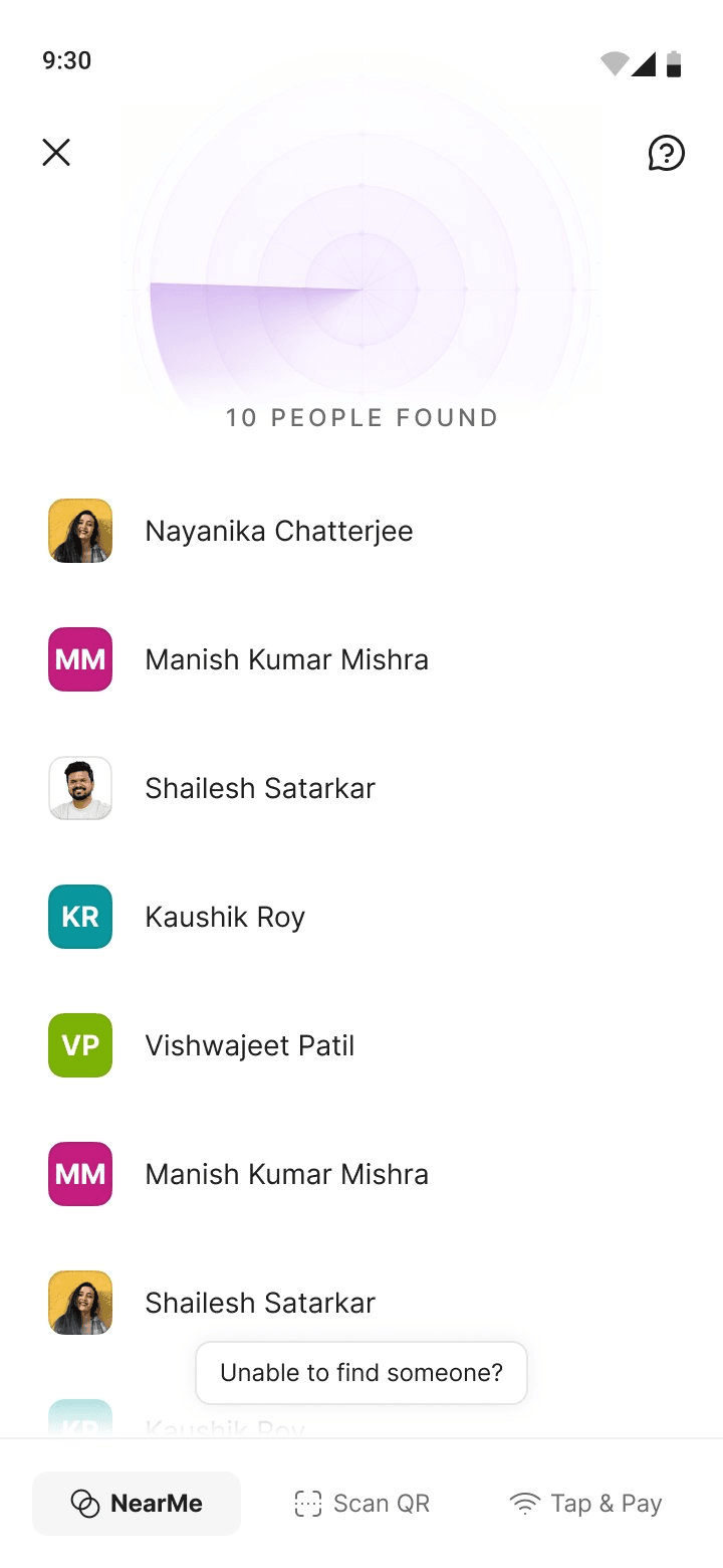
Grid View
3-column avatar grid below the radar, sorted by RSSI top-left to bottom-right. Radar compresses upward as the list grows.
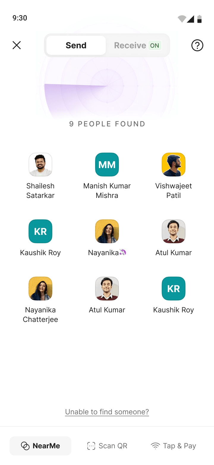
Pros
Grid reordering is far less disorienting than list reordering — position shifts are small, localised, and easy to track
Shows 6–9 people above the fold with zero scrolling needed
Radar + grid creates a clear two-act structure: radar = scanning, grid = results
Avatar tap target is generous across device sizes
Left-to-right, top-to-bottom scan pattern aligns naturally with RSSI priority order
Cons
Long banking names truncate at 2 lines (e.g. "Manish Kumar Mishra" clips)
No explicit proximity signal — position implies rank but doesn't communicate signal strength numerically
Shipped — Best balance of scannability, layout stability, and above-the-fold density
The deciding insight: In a vertical list, a single RSSI reorder shifts every item below it — the whole screen jumps. In a grid, a reorder moves one cell one position — a tiny nudge. This was confirmed in the first week of live BLE builds, and settled the debate in 48 hours. The grid wasn't the "safe" choice; it was the right one for this specific motion problem.
iOS Live Activity — Explored
We explored using iOS Live Activities to show receiver countdown state on the lock screen. The concept was promising for discoverability — receivers could see their remaining discoverable time without opening the app.

Using Dynamic Island

Active: receiving nearby

Receiving Turned Off
08- Final Solution
Feature walkthrough
Onboarding
FTUE & permission setup
The most consequential UX decision in the entire product was how to display a real-time, dynamically shifting list of nearby strangers — in a way that's scannable, identity-safe, and stable enough to trust mid-payment. We explored three distinct approaches before converging.


Sender Flow
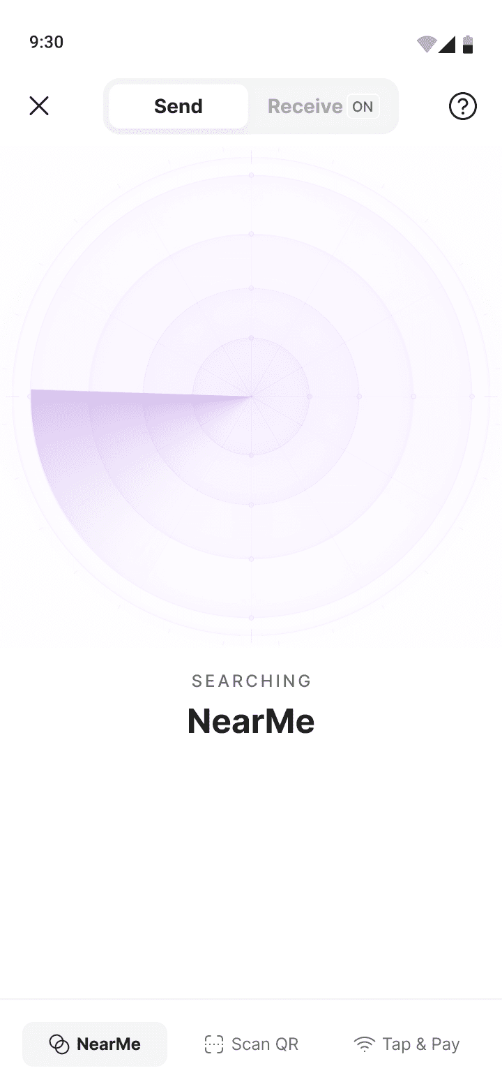
Scanning & discovery
On entering NearMe, the app begins BLE scanning immediately. A radar animation communicates that the system is actively searching — not idle. As nearby receivers appear, they populate a grid below the radar, sorted by signal strength.
↳ Receivers appear only after sustained signal for a defined interval — no transient passerby noise
↳ Saved contacts are visually prioritised at equal signal strength
↳ The radar compresses upward as the people list grows
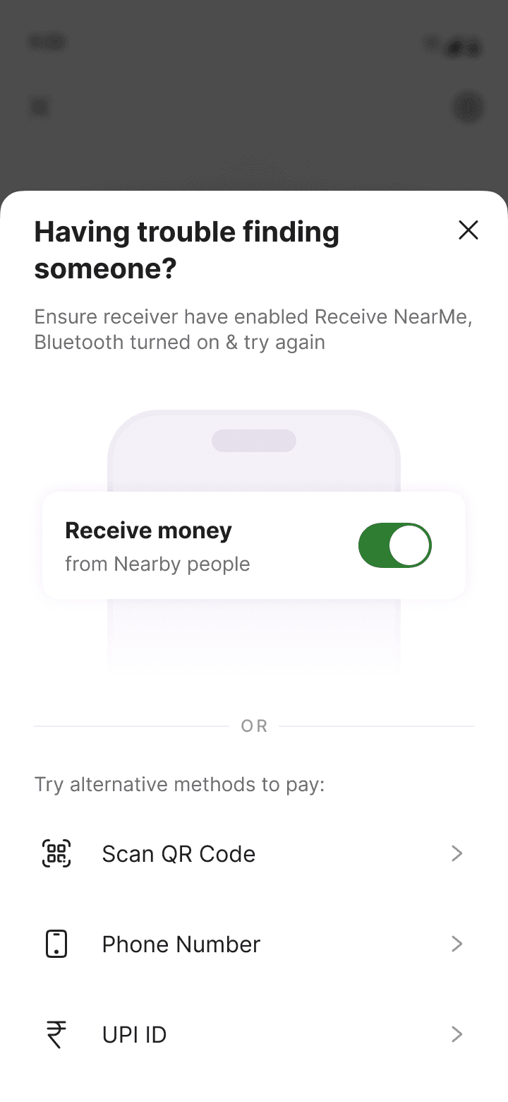
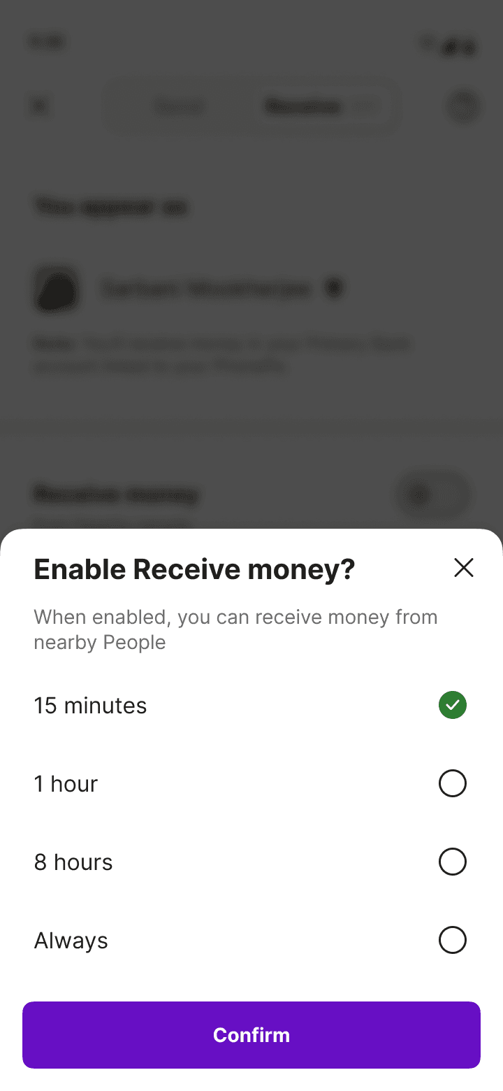
Receiver Settings
Discoverable on your terms
Receivers have full control — a clear toggle, duration options (15 min / 1 hour / 8 hours / Always), and a weekly schedule. Service workers like waitstaff can set it once and forget it; NearMe auto-activates during their shift hours.
↳ Schedule takes top priority over manual toggle state
↳ 5-minute reminder before scheduled receiving starts
↳ Quick toggle accessible from PhonePe Profile page

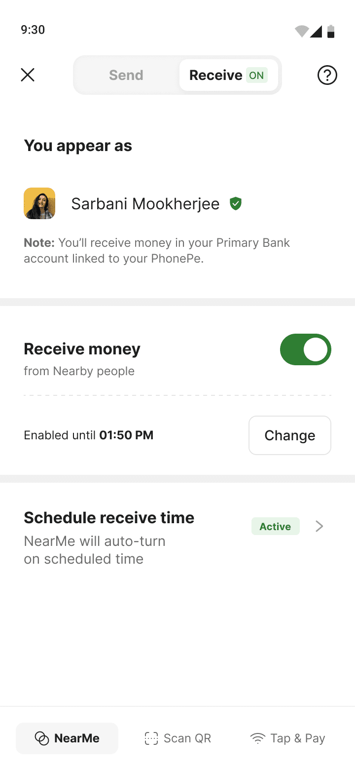
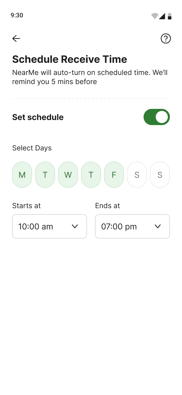
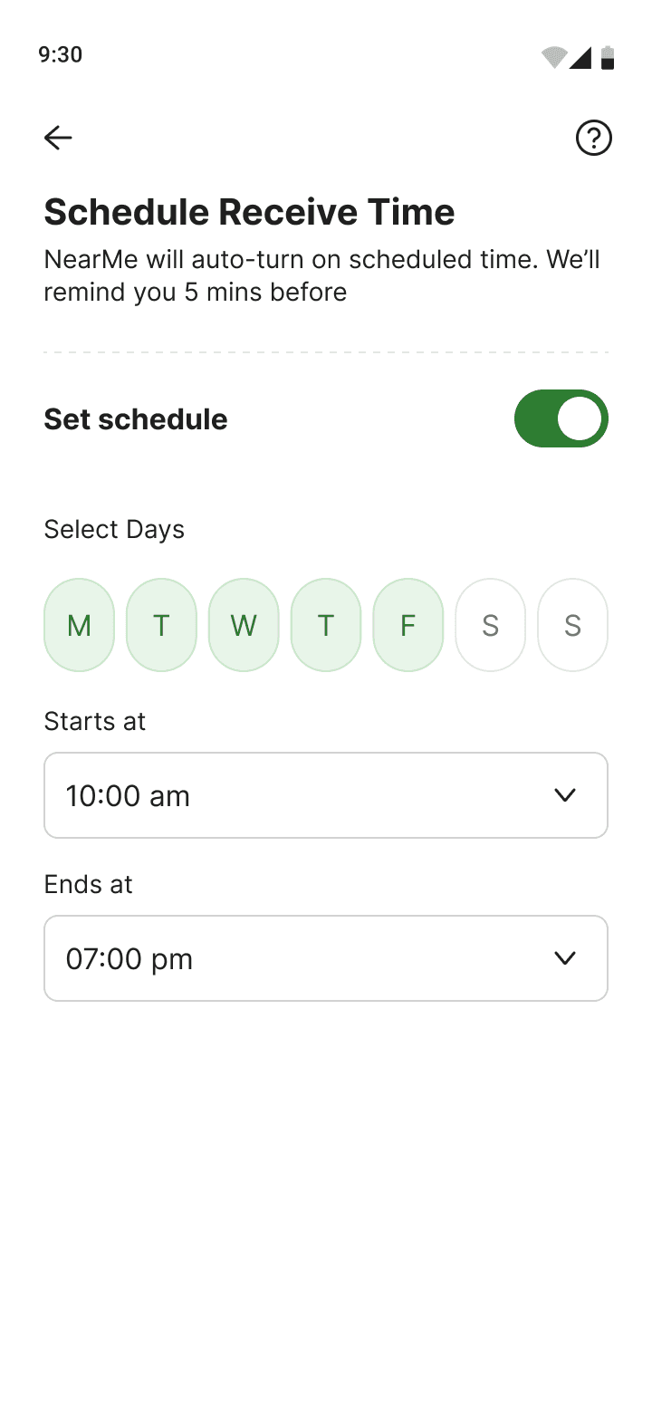
Schedule Settings
Weekly schedule for receivers
Receivers can configure a weekly schedule — selecting days and time windows when NearMe automatically activates. This was designed specifically for the service worker use case: a waiter sets Mon–Fri 10am–10pm, and never has to think about it again.
↳ Day-of-week selection with tap toggles
↳ Start and end time pickers per selected days
↳ Schedule indicator shown in the Receiver tab header
Payment
Verify, enter, pay
After tapping a person, the checkout screen shows the receiver's verified banking name prominently. The user enters an amount, optionally changes the payment instrument, and pays — all in one screen with no unnecessary navigation.
↳ Banking name used for identity — no profile photos or editable names to prevent spoofing
↳ Default instrument auto-selected, changeable inline
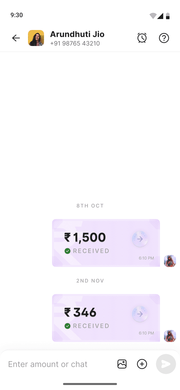
↳ For P2P entry point, a chat thread is created post-payment
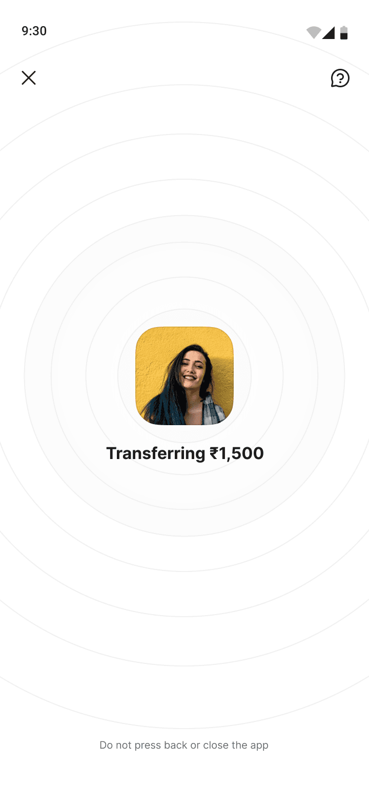
Transfer & Confirmation
Transferring & success state
During transfer, a focused screen shows the recipient with a subtle concentric ring animation — communicating active BLE proximity. Post-payment, the standard PhonePe success screen confirms the transaction, with a NearMe tag in history.
↳ Transferring screen discourages background app switch — "Do not close the app"
↳ NearMe marker in transaction history for post-hoc reference
↳ Chat History surfaces for saved contacts, not for unsaved receivers
P2P chat history integration
When initiated via the P2P entry point, NearMe payments surface in the chat thread — consistent with how other P2P payments behave. Unsaved contact payments go to history only.

End-to-end user flow
Sender Path
Sender fallback
Receiver setup
09 - Impact
Results from the internal CUG
Metrics from the internal Closed User Group (~500 PhonePe employees across Bangalore offices). A high-density, real-world environment — ideal for proximity payment validation.
94%
Task completion
First-time, unassisted
2.8s
Avg. time to identify recipient
vs. ~18s for contact search
0
Wrong payment incidents
Banking name verification held
72%
Repeat usage in 7 days
CUG 7-day retention
Battery verdict
Passive BLE scanning showed <1.5% additional drain per hour — within acceptable thresholds. Active scanning flagged for optimisation before V1 public launch.
Identity accuracy
97% of users correctly identified the intended recipient using banking name initials
Schedule adoption
38% of users who enabled receiver mode also set up a weekly schedule — much higher than expected, confirming the service worker use case resonated.
10 - Reflection
What I'd do differently & what I learned
Metrics from the internal Closed User Group (~500 PhonePe employees across Bangalore offices). A high-density, real-world environment — ideal for proximity payment validation.
What went well
Key learnings
What I'd improve